
Portfolio Category: Outdoor Advertising
-

Tabling Banners
These are two standing banners designed to be placed on both sides of a display at a festival or other tabling event.


-

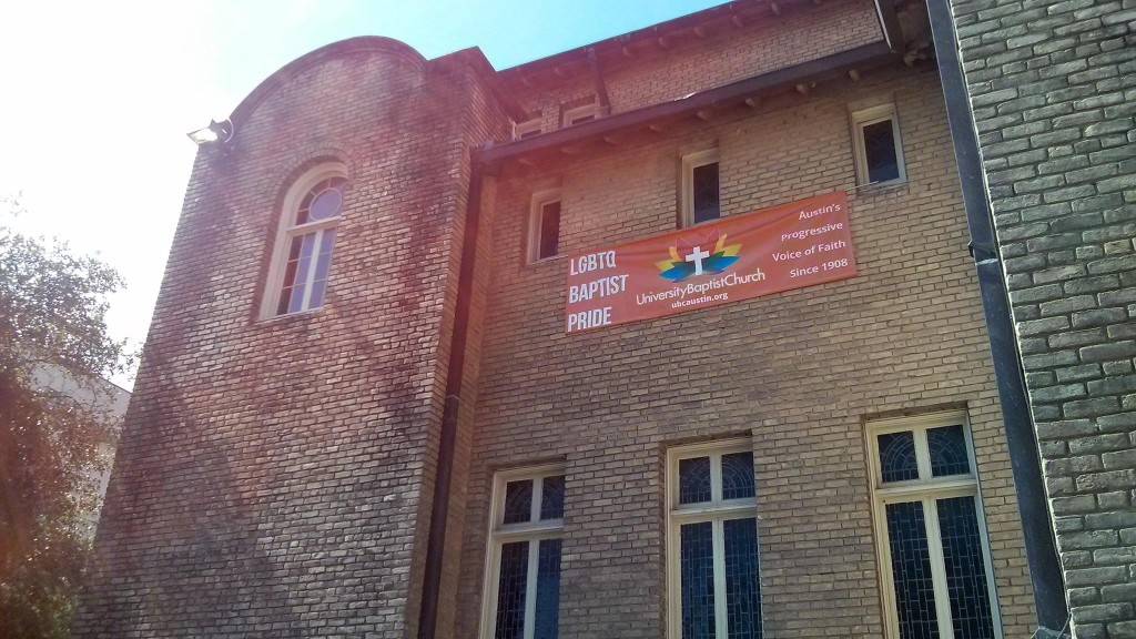
Guadalupe St. Corner Sign

Click to see the full-size version. One of UBC’s greatest assets is its location. Located on the Drag, the stretch of Guadalupe St. right next to the University of Texas campus, UBC sees tens of thousands of people walk by the church every single day.
Unfortunately, the wooden sign on the corner of Guadalupe St. had fallen into disrepair. It was dirty, the once-white paint was cracked and chipping, and the wood was warped. The sign was unwelcoming, uninviting, and most importantly, entirely unrepresentative of the good works of the church.
The idea of replacing the sign had been discussed by church members, but there had not been any recent progress on that project. In the interim, I decided the most cost-effective way of enhancing our public presence was to place a vinyl banner around the dilapidated wooden sign.
This banner cost a couple hundred dollars versus the several thousand dollars a brand new sign would have cost. I used a burnt orange background to target University of Texas students (burnt orange is one of the school colors). I made the logo most prominent because the front of the building tends to be very drab. The church’s logo is an explosion of color against an otherwise standard backdrop. The basic Sunday schedule is also featured; the majority of UBC participation takes place on Sundays, and it’s the best way to connect with the organization. A subtle, but sharp, drop shadow was used to help the text stand out and better resemble the type of physical lettering found on many outdoor signs.
By using the colorful logo, the burnt orange background, and a basic Sunday schedule I was able to design a banner that dramatically improves UBC’s visibility on the Drag while better connecting with the University of Texas population.
-

PRIDE Parade & Festival Banner

Click to see the full-size version. I originally designed this banner to be displayed during the Austin PRIDE Parade 2014. Fortunately, when the Supreme Court’s decision legalizing same-sex marriage was announced we were able to repurpose the banner and hang it on the side of our building to demonstrate our pride and solidarity with the community.
For the parade the banner has a pole pocket on the top side. Church members were able to place a metal pole through the pole pocket, gather behind the banner, and march in the PRIDE Parade. The church members ended up not using the pole pocket, and instead chose to march with the banner held in their hands. The turnout was great, and UBC’s visibility increased as a result of its participation in Austin PRIDE 2014.
I had not adequately communicated to our leaders that the banner needed to be rolled instead of folded, so unfortunately there are very visible fold lines on the banner as seen here.
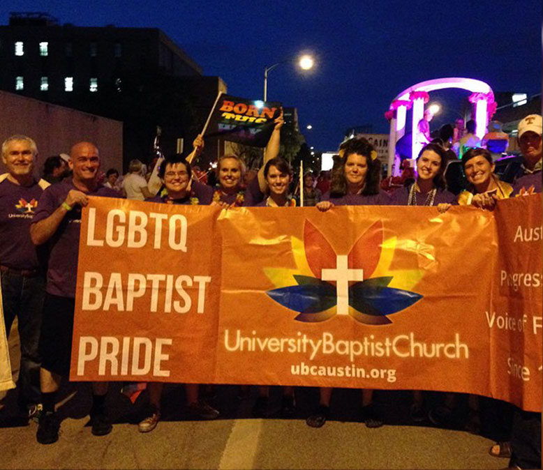
Obviously, the folding and lack of pole pocket use are not ideal, but the banner served its purpose. The church members felt energized, the church increased its visibility by participating in the parade and festival, and the community got a taste of what makes UBC unique.
The banner was designed to gently provoke the audience from afar by featuring the words “LGBTQ” and “BAPTIST” together. One of UBC’s defining characteristics is its progressive attitude toward sexuality, theology, and civil rights, and it was important that the banner highlight this. The slogan on the right, which the church had used for many years before retiring it in early 2015, helps convey the historical nature of both the church and its progressive positions.


